Un-Do-It-Yourself
Or, maybe, you stare at 'it' so long that it just always seems "fine."
Well - I was sick and tired of my kitchen window (the one over the sink).

 So, I took down the curtains. (I made the toile curtains 10 years ago when we first moved in - so they were due for removal. -as in - "I will not feel guilty about this.")
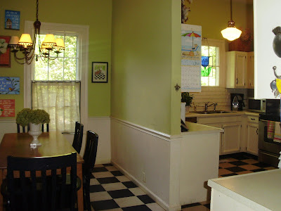
Background: My kitchen "building" was built in the 1800's, so it is actually just a large room with a wall in the middle that someone added in the 70's to have a place to hang more cabinets. The entire kitchen is 20'x15' and probably used to have a stove/fireplace at one end.
My whole point in explaining the kitchen layout has to do with the center wall. You cannot see one window from the other window. Ideally, I want my kitchen to look like this.............
 ...........But am currently lacking the funds necessary to tear down the wall, buy and install new cabinets, and purchase the white marble counters. (And also pay for a kid to go to college in 2 years, AND get a newer car, AND continue to buy shoes for the 10 year old with the fastest-growing feet EVER, AND buy groceries, etc.....)
Therefore, any changes I make must be low-budget changes.
Window #1 above the sink: I started with the storm window and curtain - removing both of them. WOW! What a difference! I am LOVING the sunlight coming through that window in the mornings! The storm window and curtain blocked ALOT more light than I would have imagined! I LOVE using my sink, now!
On to Window #2 by the table: I removed the old toile curtain and actually cleaned the windows. (shocker! for anyone that knows me). Then I moved all of the art in that area to one wall to make the window less 'bare' and the kitchen less 'busy' and to draw the eye to the one wall (instead of sending the eye into a panic "which way do I look? which way do I look?")
Problem: We have to have a curtain of some sort on that window, because there is a sidewalk and street just outside that window and we don't want the entire world watching us argue at dinner.
I went to our local Wal-Marché and bought some burlap and bias tape and made quick window treatments with a hot glue gun (and NO thread). (Also known as a Nester window mis-treatment).

I actually made the curtain in two parts, althought it looks like one curtain. That way I can let more light in, during the day (when we are all behaving). I used the selvage side of the fabric in the middle, because it doesn't need the bias tape to keep it from unraveling.

Here is a picture of both windows.

Ta-da! Out with the old! And for almost nothing ($7 for burlap and bias tape at Walmart) - I have a much brighter kitchen and can make it a little longer without my dream kitchen!
Participating in The Shabby Nest blog party and It's A Beautiful Life blog party at.......


Comments
tootles,
bunny
Gotta love burlap for a quick, chic change.
Oh and I would have never expected Alan Jackson to live in a home like that. I was expecting something simpler. Beautiful home though.
rue
TTFN~~Claudia ♥
Love the burlap window treatments. They are simple yet warm and inviting.
LeAnn:)
:)Lisa
kssnnikkel.blogspot.com
Thanks for sharing what you did to inspire us!!!
xo
~Amy
Have you thought about accidently kicking a hole in the wall that divides the kitchen and eating area? Like putting a big hole in it? So then you would have to repair it....but wait! Let's just tear it down??? I'm afraid I would have to fight the impulse to tear it down.
Or are you one of those patient people? haha.
I love your home...and those SS prints are adorable. You have great style.
Julia
i LOVE your floors! they are gorgeous.
i love that they are a creamy tone with the black. super cute!
thanks for sharing and commenting on my blog---it has been so fun to take a peek and see all of your fun projects!
have a fabulous day.
autumn